

| Minimum walkway clearance | 36 inches between furniture groupings (National Kitchen and Bath Association guidelines) |
| Standard ceiling height (residential) | 8 to 9 feet in most US homes |
| Rug sizing rule of thumb | Front legs of all seating pieces should sit on the rug |
| Art hanging height | Center of artwork at approximately 57 to 60 inches from the floor (Common museum and gallery standard) |
| Color rule of 60-30-10 | 60% dominant color, 30% secondary, 10% accent (Traditional interior design proportion guideline) |
Why this vocabulary matters
Whether you are planning a renovation, browsing decor articles, or working with an interior designer for the first time, a gap in vocabulary slows everything down. You might read about scale and assume it means size, when designers actually mean the size of an object relative to everything around it. You might hear accent wall and not realize it carries specific stylistic weight in a professional conversation.
This reference covers the terms that appear most often in design guides, client consultations, and product descriptions. Each definition is written to be usable immediately, not just memorable. For related plain-language glossaries covering other topics, see home internet terminology or personal finance terms.
Focal point
The element in a room that draws the eye first. Common examples include a fireplace, a large window, or a prominent piece of art. Furniture arrangement and lighting are typically organized around the focal point.
Vignette
A small, intentional grouping of objects, usually on a surface like a shelf or table, composed to look deliberate rather than randomly placed. Vignettes typically involve varying heights and a mix of textures.
Visual weight
How heavy or dominant an object looks, independent of its actual mass. Dark colors, large patterns, and dense textures increase visual weight. Light colors, simple patterns, and open forms reduce it.
Color temperature
The warmth or coolness of a light source or color, measured in Kelvin for light bulbs. Warm light (lower Kelvin) reads as yellow or amber; cool light (higher Kelvin) reads as blue or white. Color temperature affects how paint and fabric colors appear in a room.
Juxtaposition
Placing contrasting elements side by side to create visual interest. A rough stone surface next to polished wood is a spatial juxtaposition. Used deliberately, it keeps a room from feeling monotonous.
Rhythm (in design)
The visual pattern created by repeating or alternating elements such as color, shape, or texture throughout a space. Rhythm ties different areas of a room together without making them identical.
Sightline
The unobstructed visual path from one point in a room to another. Designers think about sightlines when placing furniture and art, because what you see when you enter a room or sit down shapes your first impression of the space.
Daylighting
The controlled use of natural light as a primary light source inside a building. Window placement, surface reflectivity, and window treatments all affect how much usable daylight a room receives.
Form
The three-dimensional shape of an object. Design discussions often distinguish between rectilinear forms (straight lines, right angles) and organic forms (curved, irregular shapes). Mixing forms adds variety; repeating them creates cohesion.
Saturation
The intensity or purity of a color. A highly saturated red is vivid; a low-saturation red appears muted or dusty. Most livable room palettes use mid- to low-saturation colors for large surfaces and reserve high saturation for small accents.
Plane
One of the flat or curved surfaces that define a room: the floor plane, wall plane, and ceiling plane. Designers think about how each plane is treated because changes to one affect the perceived size and character of the whole room.
Juxtaposition
Placing contrasting elements side by side to create visual interest. A rough stone surface next to polished wood is a spatial juxtaposition. Used deliberately, it keeps a room from feeling monotonous.
Core spatial concepts
Space planning is the foundation of any design project. Before moving furniture or choosing colors, designers think in terms of how space is divided, how people move through it, and how proportions relate.
| Minimum walkway clearance | 36 inches between furniture groupings (National Kitchen and Bath Association guidelines) |
| Standard ceiling height (residential) | 8 to 9 feet in most US homes |
| Rug sizing rule of thumb | Front legs of all seating pieces should sit on the rug |
| Art hanging height | Center of artwork at approximately 57 to 60 inches from the floor (Common museum and gallery standard) |
| Color rule of 60-30-10 | 60% dominant color, 30% secondary, 10% accent (Traditional interior design proportion guideline) |
Scale and proportion come up constantly. Scale is the size of an object relative to the room or to other objects nearby. Proportion is the relationship of parts within a single object. A very large sofa can be correctly proportioned internally but wrong in scale for a small room. These two concepts solve many layout problems that homeowners blame on style when the issue is actually spatial.
Traffic flow is the path people naturally take through a room. Good traffic flow means a clear walkway of at least 36 inches between furniture groupings, so no one has to turn sideways or step over things. The room-planning checklist walks through how to map this before rearranging anything.
Negative space is the empty area around and between objects. Designers deliberately leave negative space to prevent visual clutter and to let focal points breathe.
Color and finish terminology
Color discussions involve a precise vocabulary that is easy to misuse. A hue is the pure color family: red, blue, green. A tint is a hue with white added, making it lighter. A shade is a hue with black added, making it darker. A tone is a hue with gray added, making it more muted. When a designer says a room needs a stronger tone, they are not simply asking for a darker color.
Undertones are the subtle secondary colors within a paint color or material. A white wall can read as warm or cool depending on whether its undertones lean yellow or blue. Getting undertones wrong is the most common reason paint looks different on a wall than it did on a chip.
On surfaces, sheen or finish describes how much light a material reflects. Matte finishes absorb light and hide surface imperfections. Eggshell and satin fall in the middle range and are durable enough for most rooms. Semi-gloss and gloss finishes reflect significant light and are practical in kitchens and bathrooms but can make imperfect walls look worse.
Style categories and movements
Design style labels are loose categories, not strict rules. Knowing them helps you recognize patterns and communicate preferences without sending dozens of reference photos.
Mid-century modern describes design influenced by work produced roughly between 1945 and 1969. Characteristic features include tapered legs, low-profile furniture, organic shapes, and a preference for natural materials alongside early synthetic ones. The term is now applied broadly to anything that borrows those visual cues.
Transitional is one of the most commonly used labels in US residential design. It blends traditional forms (symmetry, classic silhouettes) with a cleaner, more restrained palette. It avoids the ornamentation of traditional styles and the severity of contemporary ones.
Biophilic design is the practice of incorporating natural elements into interior spaces to support wellbeing. This includes natural light, plants, natural textures like stone and wood, and views of the outdoors. It is a design principle with growing research behind it, not merely a trend. See the guide on choosing indoor plants for your space for practical applications.
Minimalism prioritizes function over decoration. Every object in a minimalist room is either useful or intentionally chosen for visual effect. It does not simply mean owning fewer things; it means that each choice is deliberate.
Texture, pattern, and layering
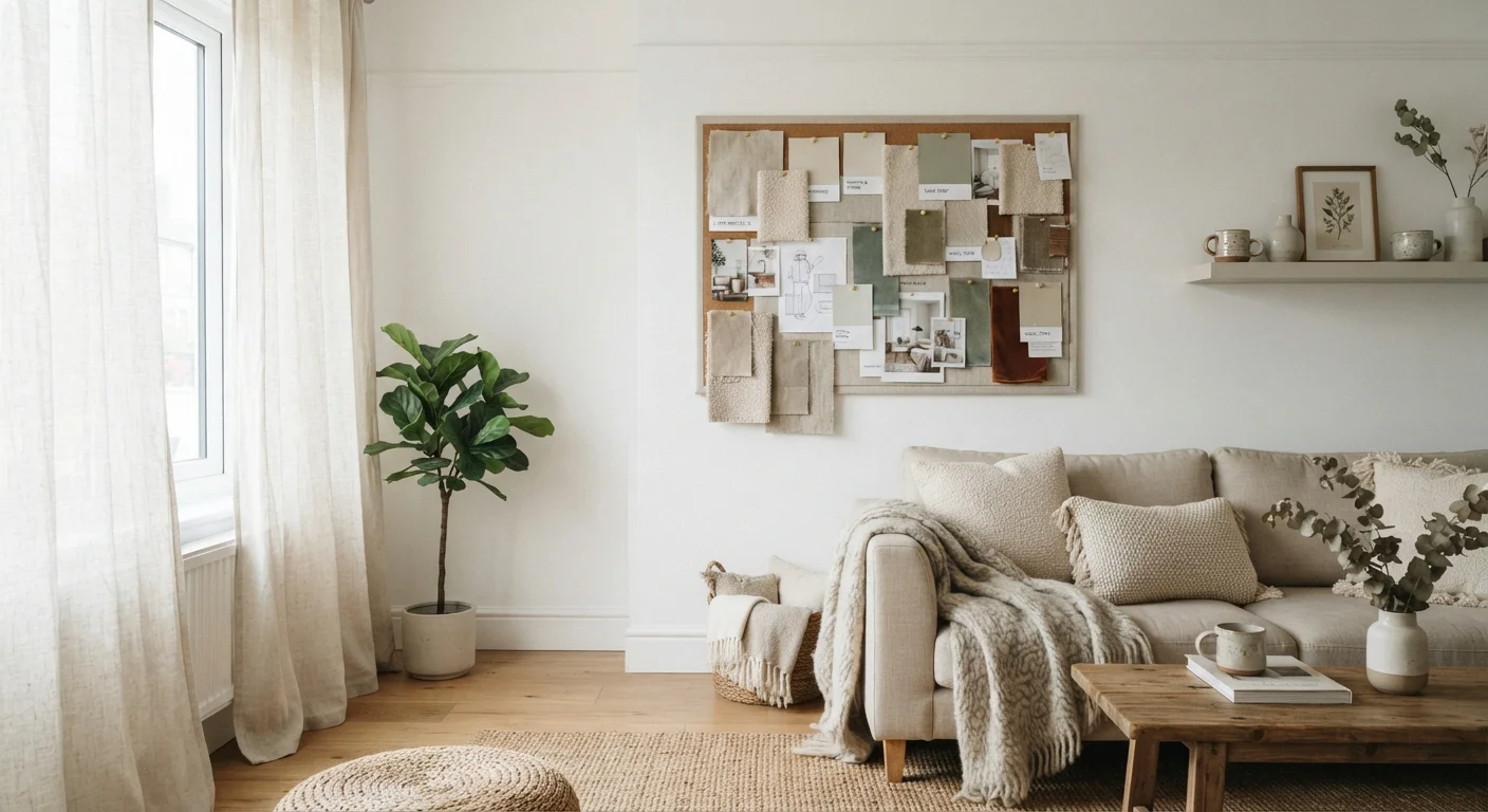
Texture in design refers to the surface quality of materials, either actual (physically rough or smooth) or visual (a pattern that implies depth). A room furnished entirely in smooth surfaces tends to feel cold or sterile even when the colors are warm. Mixing textures, such as a wool throw on a leather sofa beside a jute rug, creates the tactile variety that makes a room feel finished.
Pattern mixing is the practice of using more than one pattern in the same space. The guiding principle is scale variation: a large-scale pattern (wide stripes, oversized florals) can coexist with a medium-scale and a small-scale pattern without competing, as long as they share at least one color from a common palette.
Layering is not a single step but a sequence. Designers typically work from large to small: architectural elements, large furniture, rugs, window treatments, accent furniture, textiles, then decorative objects. Working in reverse (choosing a throw pillow first, then building outward) is a common reason rooms feel disconnected.
These concepts apply even in tight quarters. The small living room guide shows how scale, texture, and layering work when space is limited.