

Key Takeaways
- Accent walls work best when they follow the room's natural focal point, not just the biggest or most visible surface.
- Color, pattern, and texture all function differently as accent treatments, and each suits different room conditions.
- Small rooms benefit from accent walls only under specific lighting and color conditions.
- Poor placement or overuse of accent walls makes a space feel fragmented rather than layered.
Defines a focal point without structural changes
Painting or papering one wall draws the eye to a deliberate anchor, giving even a plain rectangular room a sense of intention. This requires no construction and can be reversed with a coat of paint.
Balances proportions in long or narrow rooms
A deeper color on a short end wall makes the room's length feel less extreme. This is a straightforward application of how dark colors visually advance toward the viewer.
Separates zones in open-plan spaces
In rooms without dividing walls, a single treated surface can signal a zone boundary for a dining or seating area without blocking light or traffic flow.
Lower cost than full-room repainting
Treating one wall uses significantly less paint and less labor time than repainting all four surfaces, which can make a bigger visual change accessible at lower material cost.
Lets you try bold color with less risk
A saturated hue on one wall is easier to live with and easier to change than the same color applied to the whole room, giving more room for experimentation.
Wrong wall choice creates visual fragmentation
Applying an accent treatment to a wall without a clear anchor role can make the room feel unresolved. The eye circles the room looking for a hierarchy that has not been established.
Can make small, dark rooms feel smaller
In rooms with limited natural light, a strongly contrasting accent color often reduces the sense of space rather than adding interest. Light conditions must be considered before committing.
Trend-driven treatments date quickly
Because the contrast is deliberate and noticeable, a dated accent color is more obvious than the same hue used throughout a room. Repainting to correct it requires matching faded surrounding walls.
Competes with busy surfaces already in the room
Walls holding televisions, gallery arrangements, or large windows are already doing significant visual work. Adding a contrasting color to those surfaces adds noise rather than depth.
Requires thorough prep for a clean result
A sharp contrast between the accent wall and adjacent walls makes any uneven texture, patched holes, or poor tape lines much more visible than they would be in a single-color scheme.
Our Verdict
An accent wall is a practical tool when it reinforces a room's existing architecture or focal point, and when the color or material chosen has a clear relationship to the rest of the space. It falls short when it is applied to fix a layout problem, when the chosen wall has no logical anchor role, or when the treatment competes with too many other surfaces already doing visual work.
Homeowners with a clear focal point in a room who want to define a space or add depth without a full repaint.
What an accent wall actually does
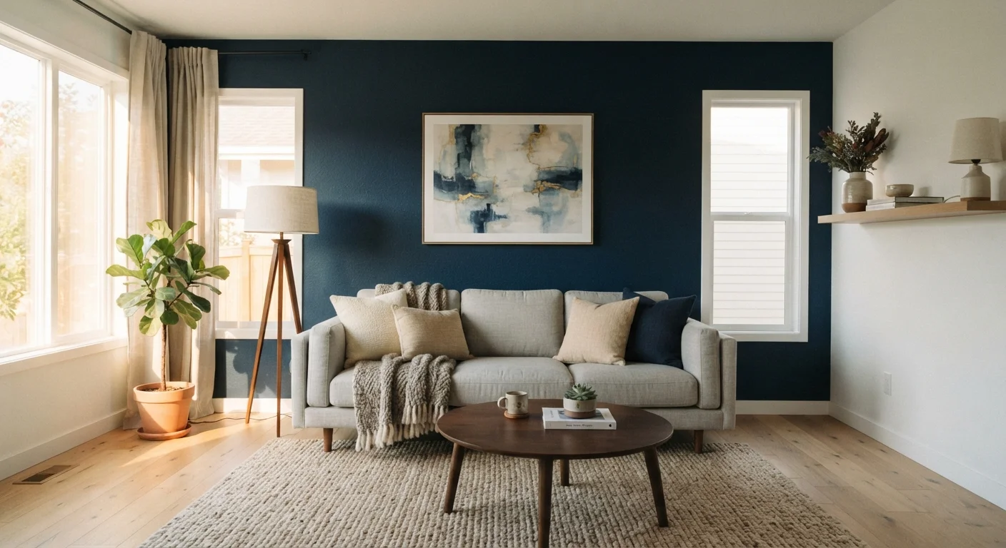
An accent wall is one surface in a room treated differently from the others, usually with a contrasting paint color, wallpaper, wood paneling, tile, or textured finish. The purpose is to draw the eye to one specific area, giving a room a visual anchor.
That function is worth taking seriously before picking up a brush. A wall becomes an accent because the room's layout already gives it prominence: the wall behind a bed headboard, the surface a fireplace sits against, or the wall a front door opens toward. When those conditions exist, an accent treatment formalizes something the room already communicates. When they do not exist, the treatment imposes a focal point where the architecture has not set one up, and the result often reads as arbitrary.
Color is the most common treatment, but texture and pattern work differently. A dark paint color recedes and can make a wall feel farther away. A warm color advances. A highly patterned wallpaper competes with furniture and art rather than framing them. Understanding those basic behaviors saves a lot of repainting.
Where accent walls genuinely add depth
Defines a focal point without structural changes
Painting or papering one wall draws the eye to a deliberate anchor, giving even a plain rectangular room a sense of intention. This requires no construction and can be reversed with a coat of paint.
Balances proportions in long or narrow rooms
A deeper color on a short end wall makes the room's length feel less extreme. This is a straightforward application of how dark colors visually advance toward the viewer.
Separates zones in open-plan spaces
In rooms without dividing walls, a single treated surface can signal a zone boundary for a dining or seating area without blocking light or traffic flow.
Lower cost than full-room repainting
Treating one wall uses significantly less paint and less labor time than repainting all four surfaces, which can make a bigger visual change accessible at lower material cost.
Lets you try bold color with less risk
A saturated hue on one wall is easier to live with and easier to change than the same color applied to the whole room, giving more room for experimentation.
Rooms with a single strong architectural anchor are the clearest candidates. A bedroom wall behind the headboard, a dining room wall behind a built-in buffet, or a living room wall that holds a fireplace all have a defined role already. Treating that surface differently confirms the hierarchy the room already has.
Long, narrow rooms also benefit. Painting the short wall at the far end of a hallway or elongated living room in a deeper tone visually shortens the room's perceived length, making proportions feel more balanced. This works because the darker surface appears to advance toward the viewer.
Open-plan layouts present a specific problem: without walls separating zones, a living area and a dining area can blur together. A single accent wall in one zone can signal where one space ends without building a physical partition. Color or texture alone can accomplish what square footage cannot.
Before any of these treatments, surface prep determines whether the finished wall looks considered or just painted in a hurry. See our guide to interior wall painting preparation for the steps that make the biggest difference in outcome.
When accent walls make a room feel cluttered
Wrong wall choice creates visual fragmentation
Applying an accent treatment to a wall without a clear anchor role can make the room feel unresolved. The eye circles the room looking for a hierarchy that has not been established.
Can make small, dark rooms feel smaller
In rooms with limited natural light, a strongly contrasting accent color often reduces the sense of space rather than adding interest. Light conditions must be considered before committing.
Trend-driven treatments date quickly
Because the contrast is deliberate and noticeable, a dated accent color is more obvious than the same hue used throughout a room. Repainting to correct it requires matching faded surrounding walls.
Competes with busy surfaces already in the room
Walls holding televisions, gallery arrangements, or large windows are already doing significant visual work. Adding a contrasting color to those surfaces adds noise rather than depth.
Requires thorough prep for a clean result
A sharp contrast between the accent wall and adjacent walls makes any uneven texture, patched holes, or poor tape lines much more visible than they would be in a single-color scheme.
The most common problem is choosing the wrong wall. In many living rooms, people default to the largest wall because it has the most surface area, but if that wall holds windows, a television, and a gallery arrangement of frames, adding a contrasting color turns the wall into a competition rather than a backdrop. The eye has nowhere to rest.
Small rooms require caution. A dark accent color in a room that already has limited natural light can make the space feel compressed rather than intimate. If all four walls are already fighting for attention through furniture, rugs, and decor, adding a fifth visual layer in the form of a bold accent makes the room feel busier, not bigger.
Accent walls can also age a space faster than a neutral scheme. Trend-driven color choices applied to one wall are more noticeable than the same hue used throughout, partly because the contrast is so deliberate. What reads as contemporary in one year can read as dated a few years later, and repainting a single wall while keeping the others is not always as simple as it sounds if the original paint has faded.
Choosing the right wall and treatment
Which walls typically work as accents
Walls that function as natural backdrops tend to hold accent treatments well: the wall behind a bed or sofa, the surface a fireplace sits against, or the wall facing the room's main entry point. Walls interrupted by multiple windows, doors, or heavily used gallery arrangements are poor candidates because the treatment competes with too many other elements. A wall that is mostly uninterrupted surface area is almost always a better choice than one broken up by architectural openings.
Start by identifying whether the room already has a natural focal point. Stand at the main entry point and notice where your eye goes first. If it lands consistently on one surface because of architecture, a fireplace, or built-in furniture, that is the wall to consider treating.
Once you have the right wall, match the treatment to the room's light conditions. Deep colors work well on north- or east-facing walls in rooms with multiple light sources. In darker rooms, a light-reflecting paint finish or a warm-toned wallpaper tends to hold better than a saturated dark color.
For textured treatments like shiplap, board-and-batten, or fabric panels, the key question is whether the room's existing materials can carry the contrast. A room already heavy in pattern, through upholstery or area rugs, usually absorbs a textured wall better than it absorbs a strongly contrasting color.
If you are uncertain, paint a large swatch directly on the wall and observe it across different times of day before committing. Artificial light changes color perception significantly, and a color that reads as calm in afternoon sun can look flat or heavy under evening lighting.